R Tutorial, Day 2: Data Visualization
Written by Kim Nicholas, Klara Winkler, & Geneviève Boisjoly;
modified from Dan Kramer, Michigan State
Learning Objectives:
Tutorial structure:
Datasets: hpi.csv, energydata.csv, impact.csv
0. Working with Scripts
We’ve created a template script file (ScriptDay2.R) for you to work with. The idea is that you write your own code here, following the structure of this tutorial.
Remember that, in the end, your script should be a clean „recipe“ that can be followed from start to finish both by R (to read in data, run your analyses, and produce plots, etc.), as well as by a human (yourself later, or another colleague)- this means it should be generously #commented to explain what you’re doing and why along the way.
Meanwhile, it’s a good idea to have a „sandbox“ section of your script where you try things out- then move them to the main script when they work as you want. It’s not a good idea to type code directly in the console- too easy to get lost.
Remember to use white spaces (return) to help your eye read the page (the same as paragraph breaks in writing).
help(plot) #You can use the help function with any other function. The
helpfile will appear in the graphics device in RStudio.
?plot #An alternate way of accessing the help file (same as above).
??plot #Searches R for the term “plot” appearing anywhere in help files.
Importing Data
We’ll start with the hpidata from yesterday. If it is not saved in your workspace (you can use ls() to check if the object “hpidata” is still in R’s memory, or just type “hpidata” and see if the data are still there), you need to read in the data again. See why it’s useful to have saved commands in scripts? J You can use the filepath you developed yesterday.
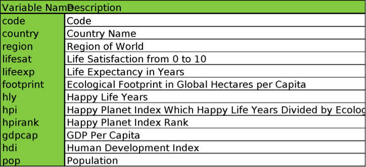
Here’s a quick reminder of some of the variables in “hpidata”. Please see Tutorial Day 1 for full meta-data. (See Figure 1 at the end).
2. Dot charts to examine one variable across cases
Dot Chart
Once you have your dataset in R, the dot chart is a great way to get a quick overview of values for a specific variable of interest. Remember that you should present plots ordered by value (from low to high) to facilitate interpretation. Below, we first sort the data from high to low for the variable “lifesat”, then plot a dotchart of this variable. We selected only the first 30 observations in this dataset because it gets hard to see the labels with many more observations. Try changing the range specified, currently rows [1:30], to see the countries with the lowest life satisfaction.
# Create a new version of hpidata, which is sorted by high to low for the value of "lifesat". (The negative sign sorts from high to low; remove it to sort from low to high.)
lifesat.sorted=hpidata[order(-hpidata$lifesat),]
head(lifesat.sorted) #inspect data
dotchart(lifesat.sorted$lifesat[1:30],labels=lifesat.sorted$country[1:30],cex=.7, main="Life Satisfaction for 30 Most Satisfied Countries", xlab="Life Satisfaction")
3. Boxplots to compare data between sites, treatments, or regions
Boxplots (R code: boxplot)
A boxplot is useful for making comparisons in the distribution of data for two or more groups. A box plot shows the median (dark middle line), the 25th percentile (lower line of box), the 75th percentile (top line of box), the minimum (lower “whisker”), the maximum (upper “whisker”), and outliers (any dots).
# MAKE ONE BOXPLOT, AND TWO SIDE BY SIDE BOXPLOTS
boxplot(hpidata$lifesat) #Plot one boxplot.
boxplot(hpidata$lifesat, hpidata$footprint)
#Plot two boxplots of different data (columns) side by side.
boxplot(hpidata$lifesat, hpidata$footprint, main="TITLE HERE!", names=c("name1 here","name2 here")) #Add a meaningful title and labels
Comparing Data with Boxplots
We may want to make comparisons with the data. For example, suppose we want to compare life satisfaction levels (lifesat) between countries above and below the global average GDP per capita (gdpcap). We can use a boxplot to do this. After the Life Satisfaction (lifesat) variable, we use a square bracket […] to restrict the cases we consider. In this example, we are comparing countries with GDPs per capita greater and lower than the average.
# SEGREGATE DATA INTO GROUPS BASED ON CRITERIA YOU SPECIFY (here above or below mean GDP)
boxplot(hpidata$lifesat [hpidata$gdpcap>mean(hpidata$gdpcap)], hpidata$lifesat [hpidata$gdpcap<mean(hpidata$gdpcap)])
Boxplots – Further Customizing and Notch
On the boxplot, the dark line represents the 50th percentile or the median. The box top and bottom of the box represent the 25th and 75th percentiles. The whiskers represent the range of the data excluding outliers. Although boxplots are descriptive, not inferential, statistical tools (they do not let us assess formal statistical significance), we can add a “notch” based on the variability of the data, and this will give us strong statistical evidence if the medians are different. If the notches do not overlap, groups are significantly different. Does there seem to be a significant difference in life satisfaction based on income per capita? (See http://www.statmethods.net/graphs/boxplot.html for more info.)
#add a notch to aid in assessing significant differences
boxplot( hpidata$lifesat [hpidata$gdpcap>mean(hpidata$gdpcap)], hpidata$lifesat [hpidata$gdpcap<mean(hpidata$gdpcap)], notch=TRUE)
#Add color
boxplot(hpidata$lifesat [hpidata$gdpcap>mean(hpidata$gdpcap)], hpidata$lifesat [hpidata$gdpcap<mean(hpidata$gdpcap)], col=c("turquoise3", "springgreen"), notch=TRUE)
#Add a legend
legend("bottomleft",c("high GDPc", "low GDPc"), fill=c("turquoise3","springgreen"))
# Add a meaningful title, x-axis labels and y-axis labels to your graphic.
TASK 1
Make a boxplot, but with different variables. Create two more graphics. Be sure to add meaningful title, x and y axis labels for each graphic.
1) Comparing countries with a high GDP per capita to those with a low GDP per capita, does life expectancy (lifeexp) appear to be different?
2) Comparing countries with high versus low ecological footprint (footprint), does the human development index (hdi) appear to be different? What does this suggest?
Discuss what you see with a neighbor. Save the script and export the graphs.
4. Scatterplots to show the relationship between two variables
Scatterplots
We can use scatterplots to show the relationship between two continuous numerical variables (those of class “numeric” in R). Here we are looking at 1) life expectancy in years with 2) GDP per capita. Generally, a scatterplot will help answer the question, “How do variable A and variable B vary together?” You can use scatterplots as purely exploratory tools to look for interesting relationships to investigate further. If you have a hunch that one variable might be driving a change in the other, then the independent variable (the one you hypothesize to be driving the change) should be plotted on the X-axis (listed first in the plot command), and the dependent variable (the one you believe is being affected) should be plotted on the Y-axis (listed second in the plot command). Use scatterplots both to assess both the direction and strength of a relationship. (The direction can be described as positive correlation = variables change in the same way, i.e., when Variable A increases, Variable B also increases; negative correlation = when one variable increases, the other decreases. Strength of a relationship is how clear of a pattern the data points follow, and can be assessed statistically; for now we are assessing it visually). As we have discussed, correlation does not demonstrate causation, so we should be cautious when interpreting it for our readers- but it can be an interesting step in doing so, or uncovering new relationships for further research.
#XY SCATTERPLOT FOR TWO CONTINUOUS, NUMERICAL VARIABLES
plot(hpidata$gdpcap,hpidata$lifeexp,col="darkblue",pch=16)
# add a meaningful title & labels (replace placeholders below). Remember you can replace the points with country names using the “text” command from yesterday if you like.
plot(hpidata$gdpcap,hpidata$lifeexp,col="darkblue",pch=16, main="title", xlab="xlab", ylab="ylab")
TASK 2
Do the variables in your graph appear to be correlated? What kind of relationship (positive or negative) is seen? Discuss with your neighbor(s).
Create another scatterplot for two other variables from hpidata. Are the variables correlated? Positively or negatively? Discuss with your neighbor(s).
****Save your script! *****
5. Bubble graphs to show the relationship between three variables
Special Plots: Bubble Graphs
Sometimes you want to graph 3 variables instead of 2, for example, if you think a third variable might be responsible for the patterns observed in the first two variables plotted. Below is the code for a bubble graph which you often see in magazines and newspapers like the New York Times. The graph below plots life satisfaction (lifesat) on the x-axis and life expectancy (lifeexp) on the y-axis.
The size of the points are scaled to show the relative size of a country’s GDP per capita (gdpcap). The “inches=0.20” command tells R that the largest point should be 0.20 inches and all others are scaled accordingly. The “bg=”#0000FF64”” is another way to select a color. In this case, the first six digits determine the color (equivalent to typing “blue”), and the last two digits, 64, determine the opacity of the points. Look at the R color chart here for all possible colors:
http://research.stowers-institute.org/efg/R/Color/Chart/ColorChart.pdf.
symbols(hpidata$lifesat, hpidata$lifeexp, circles= hpidata$gdpcap,inches=0.20, bg="#0000FF64")
text(hpidata$lifesat, hpidata$lifeexp, hpidata$code, col="black",cex=0.5)
#Add the names of the countries. It gets a little crowded with all of the countries bunched. You could add country codes (code) instead.
TASK 3
Create your own bubble graph with three of the variables from the dataset. Customize your graphic (title, labels, colors etc.). Discuss what you see with a neighbor. Export this graphic.
***Show us your graphic when you are finished, and explain what it means. ***
6. Install New Packages to Extend R’s capabilities
R has many functions built into its structure, which you have already been using. But there are many more ways you can extend the functionality of R by downloading and installing packages.
Packages are collections of functions and code in R contributed by the open-source community for special tasks ranging from analyzing biodiversity data to animating maps; there are presently over 3,000 packages, and growing.
To install a package, you need to download and install it (only the first time you use it). After the package is installed, you’ll need to use the library() command to make the functions in that package available to you in your current R session.
For more info on packages, see this page: http://www.statmethods.net/interface/packages.html
For a great overview of available packages in R, see: http://www.inside-r.org/packages
First we’ll install the “googleVis” package to help us create interactive plots.
install.packages("googleVis") #This means R is going to the server and downloading a package. Wait until the text stops and you see the blue arrow (command prompt) again, indicating the download is complete.
library(googleVis) #Makes the new googleVis package available in your current R session.
7. Interactive data visualization to look at the relationship between many variables over time
Importing New Data
We have compiled a timeseries of data on factors related to national-level ImPACT, such as CO2 emissions, population, affluence, etc., from 1960-2011 using World Bank data. With the data in this format, we can make an animated motion chart, which is great for data exploration.
First we will read in the energydata.csv file. Before you import the data, please read the description of the dataset to make sure you know what you are working with.
Note: “NA” means value missing; not all data were available for all countries for all years.
Description of “energydata.csv” and “impact.csv”
Table 1: Description of the variables for energydata.csv
Variable Name
Description / Unit
country
Name of the country
country.code
Country code
year
Year (from 1960 to 1990)
year.code
Year code
co2.emissions
CO2 emissions in kt
gdp
national GDP in constant 2005 US$
energy.use
Energy use in kt of oil equivalent
population
Population, total
affluence
Affluence, GDP/capita, constant 2005 US$/total population
intensity
Intensity, Energy/GDP (kt of oil equivalent/constant 2005 US$)
efficiency
Efficiency, Emission/energy (CO2 emissions in kt/kt of oil equivalent)
Table 2: Description of the variables for impact.csv
Variable Name
Description / Unit
Variable Name
Description
country
Name of the country
country.code
Country code
co2.emissions_1960
CO2 emissions in 1960 in kt
co2.emissions_1990
CO2 emissions in 1960 in kt
population_1960
Population in 1960, total
population_1990
population in 1990, total
affluence_1960
affluence in 1960, GDP/capita, constant 2005 US$/total population
affluence_1990
affluence in 1990, GDP/capita, constant 2005 US$/total population
intensity_1960
intensity in 1960, Energy/GDP (kt of oil equivalent/constant 2005 US$)
intensity_1990
intensity in 1990, Energy/GDP (kt of oil equivalent/constant 2005 US$)
efficiency_1960
efficiency in 1960, Emission/energy (CO2 emissions in kt/kt of oil equivalent)
efficiency_1990
efficiency in 1990, Emission/energy (CO2 emissions in kt/kt of oil equivalent)
population.rate
Population change between 1960 and 1990
affluence.rate
Affluence change between 1960 and 1990
intensity.rate
Intensity change between 1960 and 1990
efficiency.rate
Efficiency change between 1960 and 1990
energydata=read.csv("/Users/kanicholas/methods/energydata.csv", header=TRUE) #import energydata
# STOP! DID YOU READ THE META-DATA ON THE LAST PAGE? LOOK AT IT NOW BEFORE GOING FURTHER!
head(energydata) #check impact dataset
names(energydata) #get names of columns
dim(energydata) #dimensions (rows, columns) - this is a big dataset!
Motion Chart
And now (drumroll please)… the moment we’ve all been waiting for! We’ll use the energydata set to create an animated motion chart. This is one of the best ways to explore new data and look for interesting patterns. Watch out, Hans Rossling, here we come!
motion=gvisMotionChart(energydata, "country", "year") #Establishes the data for a motion chart plot using a place variable (country) and a time variable (year). This command takes a minute to create- be patient
plot(motion) #Opens a browser window to display motion
chart. BOOM!
****Save your script! ****
TASK 4
Play with this motion chart that you just created. You can change either the X or Y axis to correspond to different variables. You can have the color of the points correspond to a particular variable or to no variable at all. You can show the identity of some countries by checking the box next to them. You can select the size of the point to correspond to a particular variable, or just have them the same size. Make sure you try using the animated timeseries (click on the triangle “play” button on the first chart), and look at the three available kinds of plots using the navigation tabs in the upper right (bubble, barplot, and line). Note that the data are interactive- you can hover your mouse over them for more information.
Use the motion chart to answer the following questions:
1. In what year did China overtake the US in terms of CO2 emissions? In terms of energy use?
2. Which two countries saw a high increase in population over the years, while keeping a relatively stable affluence?
3. In 1987, which country had the highest intensity? And in 2009?
4. Which country saw a decline of its intensity between 1979 and 1999?
***Show us what you think is the most interesting trend in these data, and discuss with your neighbor. ***
8. Investigating ImPACT data
We are now going to have a look at some data behind the ImPACT identity. We have created a file called “impact.csv” with columns for each indicator (P, A, C, and T) in 1960 and in 1990. We have used these columns to calculate the annual rate of change over these 30 years for each indicator in a new column.
Using some mathematic transformations, we can approximate the total rate (in this case, emissions rate) by adding the rate of each factor, if the rates are small.
Thus, for small yearly rates, we can use the following approximation:
I=P*A*C*T -> ∆i ≈ ∆p + ∆a + ∆c + ∆t
You will need to import this file, calculate the yearly rate of change for the emissions (I), and then plot these values using a barplot similar to Fig.1 in Waggoner and Ausubel (2002) for one country, Canada. Once again, we will import data that we will use in the following section, impact.csv.
impact=read.csv("/Users/kanicholas/methodS/impact.csv", header=TRUE) # Import IMPACT (with rates of change for PACT)
names(impact)
#STOP! DID YOU READ THE META-DATA ON PAGE 9? LOOK AT IT NOW BEFORE GOING FURTHER!
impact$impact.rate=(impact$co2.emissions_1990-impact$co2.emissions_1960)/impact$co2.emissions_1960/30
#Calculate the yearly rate for impact (emissions) in a new column
head(impact) #Check to see that the new column was created and looks right.
#Now that we’ve added a column to the impact.csv file, we need to export the new data file so we can access it later. It will get the name assigned at the end of the pathname, right before “.csv”. We give it a new name so we can always go back to the original data.
write.csv(impact, "/Users/kanicholas/methods/impact2.csv")
#writes the new file you’ve created as a .csv file to your “methods” folder (change underlined part), for you to read back in later, open in Excel, etc.
#We will now plot the barplot for Canada which is row 34 [34] in the impact dataset.
barplot(c(impact$population.rate[34], impact$affluence.rate[34], impact$intensity.rate[34], impact$efficiency.rate[34], impact$impact.rate[34]), main="title here", names=c("pop.rate", "affl.rate", "intens.rate", "effic.rate", "impact rate"), ylab="y label here")
# Add meaningful title and y label
Task 5
Compare the barplot with the one in Waggoner. How does the result for Canada compare to the global one?
Does the emissions rate correspond to the sum of the four others?
That’s All Folks! Save your scripts and plots, upload your script to Live@Lund, and quit R.
Thanks for playing, see you tomorrow!
q() #Exit from R
- Know how to use the help() and example() functions in R to learn more, and for when you get stuck.
- Find and install packages to extend the functionality of R to be almost infinite!
- Use a variety of plots to explore the distribution of data and the relationships between variables, and make comparisons between data.
- Use motion charts to interactively explore trends in data over time.
Tutorial structure:
Datasets: hpi.csv, energydata.csv, impact.csv
- Getting Help in R, and tips on importing data
- Dot charts to examine one variable across cases
- Boxplots to compare data between sites, treatments, or regions
- Scatterplots to show the relationship between two variables
- Bubble graphs to show the relationship between three variables
- Install New Packages to Extend R’s capabilities
- Interactive data visualization to look at the relationship between many variables over time
- Investigating ImPACT data
0. Working with Scripts
We’ve created a template script file (ScriptDay2.R) for you to work with. The idea is that you write your own code here, following the structure of this tutorial.
Remember that, in the end, your script should be a clean „recipe“ that can be followed from start to finish both by R (to read in data, run your analyses, and produce plots, etc.), as well as by a human (yourself later, or another colleague)- this means it should be generously #commented to explain what you’re doing and why along the way.
Meanwhile, it’s a good idea to have a „sandbox“ section of your script where you try things out- then move them to the main script when they work as you want. It’s not a good idea to type code directly in the console- too easy to get lost.
Remember to use white spaces (return) to help your eye read the page (the same as paragraph breaks in writing).
- Getting Help in R
help(plot) #You can use the help function with any other function. The
helpfile will appear in the graphics device in RStudio.
?plot #An alternate way of accessing the help file (same as above).
??plot #Searches R for the term “plot” appearing anywhere in help files.
Importing Data
We’ll start with the hpidata from yesterday. If it is not saved in your workspace (you can use ls() to check if the object “hpidata” is still in R’s memory, or just type “hpidata” and see if the data are still there), you need to read in the data again. See why it’s useful to have saved commands in scripts? J You can use the filepath you developed yesterday.
Here’s a quick reminder of some of the variables in “hpidata”. Please see Tutorial Day 1 for full meta-data. (See Figure 1 at the end).
2. Dot charts to examine one variable across cases
Dot Chart
Once you have your dataset in R, the dot chart is a great way to get a quick overview of values for a specific variable of interest. Remember that you should present plots ordered by value (from low to high) to facilitate interpretation. Below, we first sort the data from high to low for the variable “lifesat”, then plot a dotchart of this variable. We selected only the first 30 observations in this dataset because it gets hard to see the labels with many more observations. Try changing the range specified, currently rows [1:30], to see the countries with the lowest life satisfaction.
# Create a new version of hpidata, which is sorted by high to low for the value of "lifesat". (The negative sign sorts from high to low; remove it to sort from low to high.)
lifesat.sorted=hpidata[order(-hpidata$lifesat),]
head(lifesat.sorted) #inspect data
dotchart(lifesat.sorted$lifesat[1:30],labels=lifesat.sorted$country[1:30],cex=.7, main="Life Satisfaction for 30 Most Satisfied Countries", xlab="Life Satisfaction")
3. Boxplots to compare data between sites, treatments, or regions
Boxplots (R code: boxplot)
A boxplot is useful for making comparisons in the distribution of data for two or more groups. A box plot shows the median (dark middle line), the 25th percentile (lower line of box), the 75th percentile (top line of box), the minimum (lower “whisker”), the maximum (upper “whisker”), and outliers (any dots).
# MAKE ONE BOXPLOT, AND TWO SIDE BY SIDE BOXPLOTS
boxplot(hpidata$lifesat) #Plot one boxplot.
boxplot(hpidata$lifesat, hpidata$footprint)
#Plot two boxplots of different data (columns) side by side.
boxplot(hpidata$lifesat, hpidata$footprint, main="TITLE HERE!", names=c("name1 here","name2 here")) #Add a meaningful title and labels
Comparing Data with Boxplots
We may want to make comparisons with the data. For example, suppose we want to compare life satisfaction levels (lifesat) between countries above and below the global average GDP per capita (gdpcap). We can use a boxplot to do this. After the Life Satisfaction (lifesat) variable, we use a square bracket […] to restrict the cases we consider. In this example, we are comparing countries with GDPs per capita greater and lower than the average.
# SEGREGATE DATA INTO GROUPS BASED ON CRITERIA YOU SPECIFY (here above or below mean GDP)
boxplot(hpidata$lifesat [hpidata$gdpcap>mean(hpidata$gdpcap)], hpidata$lifesat [hpidata$gdpcap<mean(hpidata$gdpcap)])
Boxplots – Further Customizing and Notch
On the boxplot, the dark line represents the 50th percentile or the median. The box top and bottom of the box represent the 25th and 75th percentiles. The whiskers represent the range of the data excluding outliers. Although boxplots are descriptive, not inferential, statistical tools (they do not let us assess formal statistical significance), we can add a “notch” based on the variability of the data, and this will give us strong statistical evidence if the medians are different. If the notches do not overlap, groups are significantly different. Does there seem to be a significant difference in life satisfaction based on income per capita? (See http://www.statmethods.net/graphs/boxplot.html for more info.)
#add a notch to aid in assessing significant differences
boxplot( hpidata$lifesat [hpidata$gdpcap>mean(hpidata$gdpcap)], hpidata$lifesat [hpidata$gdpcap<mean(hpidata$gdpcap)], notch=TRUE)
#Add color
boxplot(hpidata$lifesat [hpidata$gdpcap>mean(hpidata$gdpcap)], hpidata$lifesat [hpidata$gdpcap<mean(hpidata$gdpcap)], col=c("turquoise3", "springgreen"), notch=TRUE)
#Add a legend
legend("bottomleft",c("high GDPc", "low GDPc"), fill=c("turquoise3","springgreen"))
# Add a meaningful title, x-axis labels and y-axis labels to your graphic.
TASK 1
Make a boxplot, but with different variables. Create two more graphics. Be sure to add meaningful title, x and y axis labels for each graphic.
1) Comparing countries with a high GDP per capita to those with a low GDP per capita, does life expectancy (lifeexp) appear to be different?
2) Comparing countries with high versus low ecological footprint (footprint), does the human development index (hdi) appear to be different? What does this suggest?
Discuss what you see with a neighbor. Save the script and export the graphs.
4. Scatterplots to show the relationship between two variables
Scatterplots
We can use scatterplots to show the relationship between two continuous numerical variables (those of class “numeric” in R). Here we are looking at 1) life expectancy in years with 2) GDP per capita. Generally, a scatterplot will help answer the question, “How do variable A and variable B vary together?” You can use scatterplots as purely exploratory tools to look for interesting relationships to investigate further. If you have a hunch that one variable might be driving a change in the other, then the independent variable (the one you hypothesize to be driving the change) should be plotted on the X-axis (listed first in the plot command), and the dependent variable (the one you believe is being affected) should be plotted on the Y-axis (listed second in the plot command). Use scatterplots both to assess both the direction and strength of a relationship. (The direction can be described as positive correlation = variables change in the same way, i.e., when Variable A increases, Variable B also increases; negative correlation = when one variable increases, the other decreases. Strength of a relationship is how clear of a pattern the data points follow, and can be assessed statistically; for now we are assessing it visually). As we have discussed, correlation does not demonstrate causation, so we should be cautious when interpreting it for our readers- but it can be an interesting step in doing so, or uncovering new relationships for further research.
#XY SCATTERPLOT FOR TWO CONTINUOUS, NUMERICAL VARIABLES
plot(hpidata$gdpcap,hpidata$lifeexp,col="darkblue",pch=16)
# add a meaningful title & labels (replace placeholders below). Remember you can replace the points with country names using the “text” command from yesterday if you like.
plot(hpidata$gdpcap,hpidata$lifeexp,col="darkblue",pch=16, main="title", xlab="xlab", ylab="ylab")
TASK 2
Do the variables in your graph appear to be correlated? What kind of relationship (positive or negative) is seen? Discuss with your neighbor(s).
Create another scatterplot for two other variables from hpidata. Are the variables correlated? Positively or negatively? Discuss with your neighbor(s).
****Save your script! *****
5. Bubble graphs to show the relationship between three variables
Special Plots: Bubble Graphs
Sometimes you want to graph 3 variables instead of 2, for example, if you think a third variable might be responsible for the patterns observed in the first two variables plotted. Below is the code for a bubble graph which you often see in magazines and newspapers like the New York Times. The graph below plots life satisfaction (lifesat) on the x-axis and life expectancy (lifeexp) on the y-axis.
The size of the points are scaled to show the relative size of a country’s GDP per capita (gdpcap). The “inches=0.20” command tells R that the largest point should be 0.20 inches and all others are scaled accordingly. The “bg=”#0000FF64”” is another way to select a color. In this case, the first six digits determine the color (equivalent to typing “blue”), and the last two digits, 64, determine the opacity of the points. Look at the R color chart here for all possible colors:
http://research.stowers-institute.org/efg/R/Color/Chart/ColorChart.pdf.
symbols(hpidata$lifesat, hpidata$lifeexp, circles= hpidata$gdpcap,inches=0.20, bg="#0000FF64")
text(hpidata$lifesat, hpidata$lifeexp, hpidata$code, col="black",cex=0.5)
#Add the names of the countries. It gets a little crowded with all of the countries bunched. You could add country codes (code) instead.
TASK 3
Create your own bubble graph with three of the variables from the dataset. Customize your graphic (title, labels, colors etc.). Discuss what you see with a neighbor. Export this graphic.
***Show us your graphic when you are finished, and explain what it means. ***
6. Install New Packages to Extend R’s capabilities
R has many functions built into its structure, which you have already been using. But there are many more ways you can extend the functionality of R by downloading and installing packages.
Packages are collections of functions and code in R contributed by the open-source community for special tasks ranging from analyzing biodiversity data to animating maps; there are presently over 3,000 packages, and growing.
To install a package, you need to download and install it (only the first time you use it). After the package is installed, you’ll need to use the library() command to make the functions in that package available to you in your current R session.
For more info on packages, see this page: http://www.statmethods.net/interface/packages.html
For a great overview of available packages in R, see: http://www.inside-r.org/packages
First we’ll install the “googleVis” package to help us create interactive plots.
install.packages("googleVis") #This means R is going to the server and downloading a package. Wait until the text stops and you see the blue arrow (command prompt) again, indicating the download is complete.
library(googleVis) #Makes the new googleVis package available in your current R session.
7. Interactive data visualization to look at the relationship between many variables over time
Importing New Data
We have compiled a timeseries of data on factors related to national-level ImPACT, such as CO2 emissions, population, affluence, etc., from 1960-2011 using World Bank data. With the data in this format, we can make an animated motion chart, which is great for data exploration.
First we will read in the energydata.csv file. Before you import the data, please read the description of the dataset to make sure you know what you are working with.
Note: “NA” means value missing; not all data were available for all countries for all years.
Description of “energydata.csv” and “impact.csv”
Table 1: Description of the variables for energydata.csv
Variable Name
Description / Unit
country
Name of the country
country.code
Country code
year
Year (from 1960 to 1990)
year.code
Year code
co2.emissions
CO2 emissions in kt
gdp
national GDP in constant 2005 US$
energy.use
Energy use in kt of oil equivalent
population
Population, total
affluence
Affluence, GDP/capita, constant 2005 US$/total population
intensity
Intensity, Energy/GDP (kt of oil equivalent/constant 2005 US$)
efficiency
Efficiency, Emission/energy (CO2 emissions in kt/kt of oil equivalent)
Table 2: Description of the variables for impact.csv
Variable Name
Description / Unit
Variable Name
Description
country
Name of the country
country.code
Country code
co2.emissions_1960
CO2 emissions in 1960 in kt
co2.emissions_1990
CO2 emissions in 1960 in kt
population_1960
Population in 1960, total
population_1990
population in 1990, total
affluence_1960
affluence in 1960, GDP/capita, constant 2005 US$/total population
affluence_1990
affluence in 1990, GDP/capita, constant 2005 US$/total population
intensity_1960
intensity in 1960, Energy/GDP (kt of oil equivalent/constant 2005 US$)
intensity_1990
intensity in 1990, Energy/GDP (kt of oil equivalent/constant 2005 US$)
efficiency_1960
efficiency in 1960, Emission/energy (CO2 emissions in kt/kt of oil equivalent)
efficiency_1990
efficiency in 1990, Emission/energy (CO2 emissions in kt/kt of oil equivalent)
population.rate
Population change between 1960 and 1990
affluence.rate
Affluence change between 1960 and 1990
intensity.rate
Intensity change between 1960 and 1990
efficiency.rate
Efficiency change between 1960 and 1990
energydata=read.csv("/Users/kanicholas/methods/energydata.csv", header=TRUE) #import energydata
# STOP! DID YOU READ THE META-DATA ON THE LAST PAGE? LOOK AT IT NOW BEFORE GOING FURTHER!
head(energydata) #check impact dataset
names(energydata) #get names of columns
dim(energydata) #dimensions (rows, columns) - this is a big dataset!
Motion Chart
And now (drumroll please)… the moment we’ve all been waiting for! We’ll use the energydata set to create an animated motion chart. This is one of the best ways to explore new data and look for interesting patterns. Watch out, Hans Rossling, here we come!
motion=gvisMotionChart(energydata, "country", "year") #Establishes the data for a motion chart plot using a place variable (country) and a time variable (year). This command takes a minute to create- be patient
plot(motion) #Opens a browser window to display motion
chart. BOOM!
****Save your script! ****
TASK 4
Play with this motion chart that you just created. You can change either the X or Y axis to correspond to different variables. You can have the color of the points correspond to a particular variable or to no variable at all. You can show the identity of some countries by checking the box next to them. You can select the size of the point to correspond to a particular variable, or just have them the same size. Make sure you try using the animated timeseries (click on the triangle “play” button on the first chart), and look at the three available kinds of plots using the navigation tabs in the upper right (bubble, barplot, and line). Note that the data are interactive- you can hover your mouse over them for more information.
Use the motion chart to answer the following questions:
1. In what year did China overtake the US in terms of CO2 emissions? In terms of energy use?
2. Which two countries saw a high increase in population over the years, while keeping a relatively stable affluence?
3. In 1987, which country had the highest intensity? And in 2009?
4. Which country saw a decline of its intensity between 1979 and 1999?
***Show us what you think is the most interesting trend in these data, and discuss with your neighbor. ***
8. Investigating ImPACT data
We are now going to have a look at some data behind the ImPACT identity. We have created a file called “impact.csv” with columns for each indicator (P, A, C, and T) in 1960 and in 1990. We have used these columns to calculate the annual rate of change over these 30 years for each indicator in a new column.
Using some mathematic transformations, we can approximate the total rate (in this case, emissions rate) by adding the rate of each factor, if the rates are small.
Thus, for small yearly rates, we can use the following approximation:
I=P*A*C*T -> ∆i ≈ ∆p + ∆a + ∆c + ∆t
You will need to import this file, calculate the yearly rate of change for the emissions (I), and then plot these values using a barplot similar to Fig.1 in Waggoner and Ausubel (2002) for one country, Canada. Once again, we will import data that we will use in the following section, impact.csv.
impact=read.csv("/Users/kanicholas/methodS/impact.csv", header=TRUE) # Import IMPACT (with rates of change for PACT)
names(impact)
#STOP! DID YOU READ THE META-DATA ON PAGE 9? LOOK AT IT NOW BEFORE GOING FURTHER!
impact$impact.rate=(impact$co2.emissions_1990-impact$co2.emissions_1960)/impact$co2.emissions_1960/30
#Calculate the yearly rate for impact (emissions) in a new column
head(impact) #Check to see that the new column was created and looks right.
#Now that we’ve added a column to the impact.csv file, we need to export the new data file so we can access it later. It will get the name assigned at the end of the pathname, right before “.csv”. We give it a new name so we can always go back to the original data.
write.csv(impact, "/Users/kanicholas/methods/impact2.csv")
#writes the new file you’ve created as a .csv file to your “methods” folder (change underlined part), for you to read back in later, open in Excel, etc.
#We will now plot the barplot for Canada which is row 34 [34] in the impact dataset.
barplot(c(impact$population.rate[34], impact$affluence.rate[34], impact$intensity.rate[34], impact$efficiency.rate[34], impact$impact.rate[34]), main="title here", names=c("pop.rate", "affl.rate", "intens.rate", "effic.rate", "impact rate"), ylab="y label here")
# Add meaningful title and y label
Task 5
Compare the barplot with the one in Waggoner. How does the result for Canada compare to the global one?
Does the emissions rate correspond to the sum of the four others?
That’s All Folks! Save your scripts and plots, upload your script to Live@Lund, and quit R.
Thanks for playing, see you tomorrow!
q() #Exit from R


R Tutorials by Kimberly A. Nicholas is licensed under a Creative Commons Attribution-NonCommercial-ShareAlike 4.0 International License.